Purpose and scope
Each WebShop page is built by combining several sections to showcase your company and product to their best advantage. Each section can contain blocks, pages, or links, or a combination of these three items.
You can use either Pages (found in the Management Interface) or Visual Editor (found in WebShop) to add, edit, or delete blocks. In Pages, a block is one or more elements stored under the same branch in the content navigational tree. In Visual Editor, a block is an element that you drag and drop from the controls on left panel to the main content body. The same set of blocks is used in both methods.
The purpose of this article is to list and explain the purpose of each block type.
Terms and concepts used in this article
|
Term |
Definition |
|---|---|
|
Block |
one or more elements that are stored under the same branch within the navigational tree. |
|
Branch |
set of nodes where a node can be a link, a page or a block. |
|
Navigational tree |
file directory that contains WebShop content consisting of branches and node. |
|
Mode |
specifies which set of blocks are available for use when you use Visual Page Builder. Two modes are available:
|
|
Really Simple Syndication |
(RSS), a standardised system for distributing content from an online publisher. |
|
Slider |
a control that allows you to scroll horizontally through a number of items without changing the display format or other information on the screen. |
|
WYSIWYG editor |
a text editor that displays your content as you would see it on WebShop. |
Available block
The same set of blocks is used in both Pages and Visual Editor. This article lists the blocks available in both Pages and Visual Editor. Read our step-by-step guides on how to build content in Pages and Visual Editor. In both cases, the list of block types available is:
|
Block name in Pages |
Block name in Visual Page Builder |
Block icon in Visual Page Builder |
Description |
Mode |
|
|
|---|---|---|---|---|---|---|
|
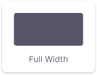
CMS - Section |
Found under Layout in the panel on the left. Block name: Full Width
|
|
Displays a full-width content block. |
Basic |
|
|
|
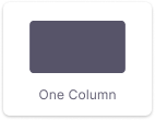
CMS - Grid Column and/or CMS - Grid (With Columns) nested in a CMS - Section |
Found under Layout in the panel on the left. Block name: One column |
|
Displays a one-column content block. |
Basic |
|
|
|
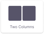
CMS - Grid Column and/or CMS - Grid (With Columns) nested in a CMS - Section |
Found under Layout in the panel on the left. Block name: Two columns |
|
Displays a two-column content block. |
Basic |
|
|
|
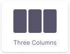
CMS - Grid Column and/or CMS - Grid (With Columns) nested in a CMS - Section |
Found under Layout in the panel on the left. Block name: Three columns |
|
Displays a three-column content block. |
Basic |
|
|
|
CMS - Grid Column and/or CMS - Grid (With Columns) nested in a CMS - Section |
Found under Layout in the panel on the left. Block name: Four columns |
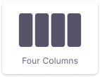
|
Displays a four-column content block. |
Basic |
|
|
|
CMS - Grid Column and/or CMS - Grid (With Columns) nested in a CMS - Section |
Found under Layout in the panel on the left. Block name: Six columns |
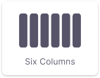
|
Displays a six-column content block. |
Basic |
|
|
|
Banner - Grid |
Found under Banner in the panel on the left. Block name: Banner |
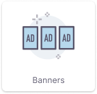
|
Displays a preselected banner as a single item or in columns (2,3,4 or 6). Key points Banner sets must be configured before using this block. To configure a banner set, select Banners in the Management Interface. Configurable options
|
Basic |
|
|
|
Banner - Slider |
Found under Banner in the panel on the left. Block name: Banner Slider |
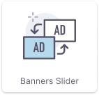
|
Displays preselected banners as a slider item or in columns (2,3,4 or 6). Key points Banner sets must be configured before using this block. To configure a banner set, select Banners in the Management Interface. Configurable options
|
Basic |
|
|
|
Banner - Slider Hero |
Found under Banner in the panel on the left. Block name: Slider Hero |
|
Displays the image as a large full-width Hero Banner. Offers different transition styles, automatic pagination, and selectable transition time. Key points Banner sets must be configured before using this block. To configure a banner set, click Banners in the Management Interface. Configurable options
|
Basic |
|
|
|
CMS - Content |
Found under Content in the panel on the left. Block name: Text |
|
Use a WYSIWYG editor to create content for display |
Basic |
Use a WYSIWYG editor to create content for display.
|
Basic |
|
CMS - Image Overlay |
Found under Content in the panel on the left. Block name: Image |
|
Display an uploaded image. Configurable options
|
Basic |
|
|
|
Image + Text |
Found under Content in the panel on the left. Block name: Image + Text |
|
Display an uploaded image and a text block. Configurable options
|
Basic |
|
|
|
CMS - Latest Grid |
Found under Content in the panel on the left. Block name: Latest Listing |
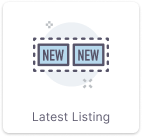
|
Displays child pages of a selected page as a single block. The main page can be selected, view all button, and a publication date. Configurable options
|
Expert |
|
|
|
CMS - Latest Slider |
Found under Content in the panel on the left. Block name: Latest Listing Slider |
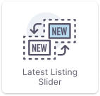
|
Displays child pages of a selected page as a single block with slider option. Configurable options
|
Expert |
|
|
|
CMS - Media Element |
Found under Content in the panel on the left. Block name: Icon + Text |
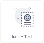
|
Displays text with a title and an image. Configurable options
|
Basic |
|
|
|
CMS - Slider |
Found under Content in the panel on the left. Block name: CMS Slider |
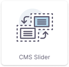
|
Use a WYSIWYG editor to create content for display with a slider option Configurable options
|
Expert |
|
|
|
CMS - Tabs |
Found under Content in the panel on the left. Block name: Tabs |
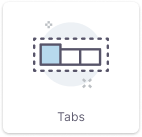
|
Add tabs.
|
Expert |
|
|
|
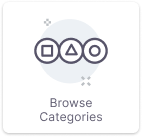
Category - Browse Categories |
Found under Category in the panel on the left. Block name: Browse Categories |
|
Include a section containing category names and an image for each category. Each row can have 1 to 6 categories displayed as circles. Configurable options
|
Available as part of the Machinery and Spare Parts SmartPack. |
|
|
|
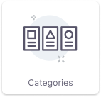
Category - Grid Select |
Found under Category in the panel on the left. Block name: Categories |
|
Displays chosen category as a single item or columns (2,3,4,6). Configurable options Categories can be added one by one. Adding more categories within a selected columns amount adds additional row. |
Basic |
|
|
|
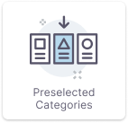
Category - Grid |
Found under Category in the panel on the left. Block name: Preselected categories |
|
Displays chosen category as a single item or columns (2,3,4,6). Configurable options
|
Expert |
|
|
|
Category - Grid with Highlight |
Found under Category in the panel on the left. Block name: Category Grid with Highlight |
|
Displays one main category and four sub-categories.
|
Basic |
|
|
|
Deep Search |
Found under Misc in the panel on the left. Block name: Deep Search |
|
Improved category and category child search by providing two drop-down boxes which are populated with a category and its children and an additional search box where your customer can further refine what they are searching for. |
Available as part of the Machinery and Spare Parts SmartPack. |
|
|
|
Twig Block |
Found under Misc in the panel on the left. Block name: Twig Block |
|
Use the in-built Twig editor to extend the look and feel of your WebShop pages by using our templating language, Twig. Twig consists of a standard syntax that uses expressions, variables and tags to control the content and logic of each template. See an example of this here. |
|
|
|
|
External Page Feed (RSS) |
Found under Misc in the panel on the left. Block name: RSS Feed |
|
Adds a RSS feed to your WebShop. Key points
Configurable options
|
Basic |
|
|
|
Animate in |
Found under Misc in the panel on the left. Block name: Animate in |

|
Adds an animation to a content block. Configurable options
|
Expert |
|
|
|
Form - Wufoo |
Found under Third Party in the panel on the left. Block name: Wufoo Form |

|
Adds a Wufoo form to your WebShop. Key points Before adding this block, you must:
|
Basic |
|
|
|
Media - Video |
Found under Content in the panel on the left. Block name: Video |
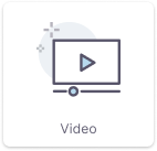
|
Adds video.
|
Basic |
|
|
|
Product - Add to Cart |
Found under Product in the panel on the left. Block name: Add to Cart |
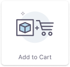
|
Adds “Add to Cart” block with quantity field. |
Expert |
|
|
|
Product - Grid |
Found under Product in the panel on the left. Block name: Products |
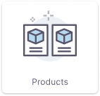
|
Select specific products from your product list, which are displayed as single item. Configurable options
|
Basic |
|
|
|
Product - Slider |
Found under Product in the panel on the left. Block name: Product Slider |
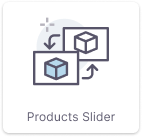
|
Select specific products from your product list, which are displayed as single item with slider option. Configurable options
|
Basic |
|
|
|
Reviews IO |
Found under Third Party in the panel on the left. Block name: Reviews.io |
|
Adds a reviews.io feed to your WebShop. |
Basic |
|
|
|
Trust Pilot |
Found under Third Party in the panel on the left. Block name: Trustpilot |
|
Adds a Trustpilot feed to your WebShop. |
Basic |
|
|
|
Flockler |
Found under Third Party in the panel on the left. Block name: Flockler |

|
Adds a Flockler feed to your WebShop. Read Adding a Flockler social media feed to WebShop for more information about Flockler social media feed. Key points Before adding this block, you must have a Flockler social media feed. |
Available as part of the Digital Marketing SmartPack. |
|
|
Related content